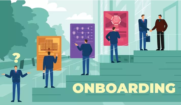
Onboarding: Vital Aspects to Be Taken into Consideration
Onboarding refers to the process of acquainting users with your product, be it a website, an app, or any other offering. It's crucial to guide new users through this process and emphasize the benefits of your product, as they may not be familiar with all its features.
Since you only get one chance to make a first impression, it's essential to approach it thoughtfully. Provide users with detailed information on the essential aspects without pressuring them to make a purchase or engage in activities they're not interested in.
The purpose and goals of onboarding
This is a collection of marketing initiatives made to acquaint users with different products, explain all of their advantages, and make them aware of the problems the products may solve.
It is comparable to a guide in terms of how quality onboarding should be seen. A professional tour guide will take you to the best cafes, point out the most intriguing sights, and advise you on what to bring home as a souvenir.

A bad guide will engross you in crowded downtown restaurants and well-trodden tourist paths, making you want to leave. The client experiences both positive and negative onboarding in the same way.
Onboarding is part of a marketing retention strategy aimed at keeping customers and maintaining their loyalty.
Let's analyze onboarding from the viewpoint of attracting the target audience. The marketing campaign starts by showing the product's best aspects and assuring the customer that it will meet their needs. Additionally, onboarding aids in persuading the audience of this. Then comes the phase of active sales, and after that comes the instruction phase.
That is, we make a distinction between the onboarding that is provided to customers who have previously purchased the product and the first-time onboarding. Their fundamental difference lies in their goals.
First-use onboarding aims to move from high conversion rates to direct actions. Once a purchase is made, onboarding aims to retain and support customers.
Types of onboarding

Swipe
These are moving banners that replace each other in the center of the screen, which can be scrolled through (swiped). They demonstrate the key benefits of the product. Swipes should remind the user what benefits and privileges they will get from using this product.
Mobile apps employ this kind of onboarding more frequently than desktop ones do. Its primary responsibility is to show the user the best features of the product. and to do it brightly and quickly, while a person is still interested in flipping through swipes. It is better not to present more than 3–4 screens.
Welcome email
A welcome letter is automatically sent to your email after registration. This is required to stay in touch with the user and pique his interest in learning more about the product. If we are talking, for example, about a media space with a large number of headings and publications, the letter contains some of the most striking materials. The Medium resource offers an article on the mailing list that can evoke a lively response in the reader and attract them to the platform.
Sequence of letters
If the company's goal is to engage customers in the use of a complex product, several related letters may be sent out. At first, this letter is to attract attention and make acquaintances. Then, on the mailing list, they suggest how to use the service. Tilda makes chains of five letters. To keep the audience loyal, each email tells you how many more emails will be sent. Each new email more and more draws the consumer into active use of the service.
When developing onboarding through a chain of welcome emails, write down their thematic plan. An uncomplicated product for everyday life does not require detailed instructions for use. It is more logical for him to write emails that contain a call to action: talk about discounts, special promotions, offer promo codes, etc. If it’s not easy to understand a digital product the first time, it makes sense to dedicate the mailing list to studying it.
Product presentation
The purpose of this type of onboarding is purely educational. It is implemented using swipes, short videos, or pop-up windows with hints.
Since all services look simpler in mobile applications than on a PC, product presentations resemble swipes. The difference is that in swipes, the client is shown what they can get from this product, and in production, how they will get it. For example, a swipe screen on an online fitness platform provides information about the possibility of selecting a personalized workout. And the product tour tips tell you in which section you can find this service.
User cases
This is a set of special settings for a specific audience group. In a sense, a product presentation with more individualization.
The user case offers to let you choose solutions according to your taste. The familiar interface creates more comfortable conditions for using the application, and it is easier for the user to understand it.
Most often, user cases offer to choose from several templates. There is a nuance that you should pay attention to: the client must be allowed not only to choose a case but also to try it “by touch” before working on it. So they are more likely to make a decision about paying for a subscription, purchasing, etc.
Involving onboarding
It helps to get acquainted with a digital product. The user participates in the use of the service by performing specific actions.
This helps the app know the user's tastes to make a selection and also entertains the client. These gaming onboarding options are always more successful than others (especially on entertainment platforms). They immediately immerse the audience in a relaxing atmosphere and allow you to distract yourself and relax.
Post a task on Insolvo to find a virtual assistant to help you with onboarding.
Headings: Programming & Web


