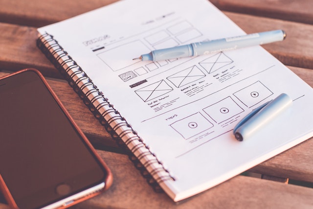
Home page: 5 best tips to structure the strong home page for your website
Customers frequently begin their research on your company by visiting the homepage. Consequently, the first impression that a user has of a brand is based on its design, functionality, usability, and information content. In this post, you will discover how to create a website's home page.

Consider the goals that your home page should have
A home page functions as the starting point of interaction with a potential customer. As a result, your home page ought to leave users with a positive impression. Second, a homepage serves as a central place for information; when visiting this page, the user must know where to look for the necessary information. Thirdly, a site should provide the customer with some fundamental functionality, such as the ability to create an account and log in, request a callback, instantly purchase a hot item, sign up for a newsletter, etc.
Add the following characteristics to your home page to make it ideal:
- Clear Data. A customer must get clear and comprehensive answers to the following questions:
- general information on the company;
- general product details;
- information on the advantages (and the reasons you should purchase the brands' items).
- Readable texts. A homepage must use clear language to address both current and new customers. Try to minimize professional slang.
- Unique selling proposition. Briefly explain to the customer why working with you is profitable. Use images additionally to your texts to deliver this information.
- Functionality and usability. The homepage must be simple to use and intuitive. Simple navigation, registration and authorization forms, a callback request feature, mobile traffic optimization, and the possibility to purchase specific items directly from the main page. Nevertheless, there shouldn't be too much content, functionality, or controls on the home page.
- A call to action. Your home page should have a call to action section that will lead your customers to make actions you want them to make.
- Relevance. The home page must be updated frequently and customized to the audience's requirements. This can be accomplished with dynamic content such as rotating products featured on the homepage and dynamically updated announcements of articles, actions, and news.
- Page visual design. Although it should go without saying, website owners occasionally overlook this criterion.

Creating a logo for your home page
A logo serves as the navigation bar in addition to being a branding feature. By just clicking on the resource's emblem, the user can quickly return to the resource's home page from any page.
The Navbar: its appearance and function
When creating your site's navigation, keep in mind that each user has already accessed thousands of other websites. Use only the vertical and horizontal menus. The "Contacts" button is on the far right of the horizontal menus and lowers in the vertical menus, making it easy for the user to locate. Keep using the same navigation; do not invent it.
Should a footer be included on a home page?
Some website designers do not add a footer. We insist that a footer is an integral part of any website. It serves as a repository for technical data, including license details, copyright, visiting counters, contacts, etc. Links to reviews, information about awards and honors, and other trustworthy material may be added to your footer.

Unique selling proposition: what should it look like?
A crucial component of the home page is a unique selling proposition. It is a text that consists of a heading, a few paragraphs, a few lists, and a few subtitles. State the unique selling proposition by answering the following questions:
- What kind of business is this website and what is its purpose?
- What can I get from this website?
- What are the benefits?
Try to simplify your responses into a few phrases. Try structuring the text and replacing some ideas with illustrations.

Help the customer make the desired action
A visitor is more likely to choose nothing if the home page has too much information, forms, and buttons.
Consequently, if you are unable to limit an offer to the main one, assist the visitor in making the best decision. Make the desired action stand out. This is possible due to the button or form's size and color, as well as its placement or description.
The homepage's images
Images strengthen the page's visual quality. On the whole, you may simply locate images that instantly appeal to users.
The process of improving a homepage never ends
The home page needs to be continually updated. Test new versions of the page using A/B testing. Don't add too many extra items to the main page.
Insolvo freelancers will help you if you need to develop or upgrade your homepage. Post a task.
You may also read our guide on how to order a website.
Headings: Programming & Web


