How to visualize the data on the site
Figures in any industry are an objective indicator, and figures that meet the stated KPIs or prove large production volumes are doubly useful. Let's figure out how to correctly and beautifully visualize the data on the site.

Charts and graphs
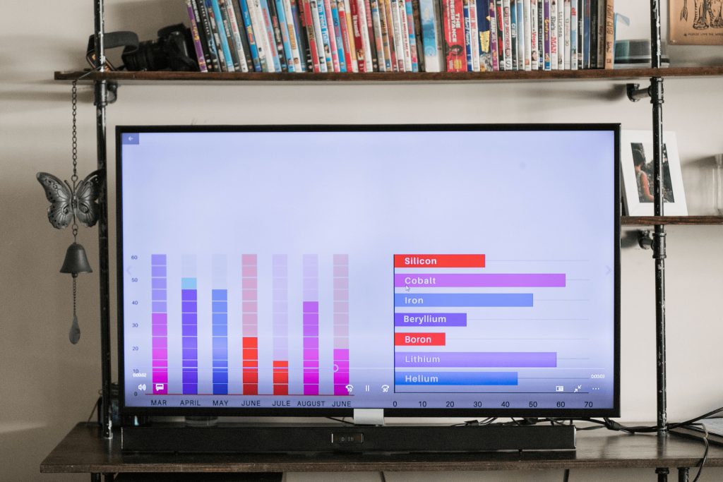
The most proven way to visualize data is with graphs and charts. With the help of graphs, it is possible to show the manufacturer's market share, prove that the agency's advertising campaigns are working, or brag about the growth in the number of staff. But the website is the face of the company, so an Excel chart made in 5 minutes is not suitable for presenting your achievements. Here are some tips on how beautifully you can present charts with achievements:
• Collect only key data. Even if the numbers are beautiful, it is not necessary to show a slice of statistics by day over a semi-annual period;
• Contact the designer. Yes, charts and graphs can also be stylish and deliver visual enjoyment;
• Be sure to sign the data. If you are fluent in figures and reports, this does not mean at all that a visitor to your site will immediately understand what the diagram is about.
When publishing graphs and diagrams, we advise you to pay attention to the size of the image. Keep in mind that your site is viewed from different devices and at different resolutions. And if you have the opportunity (or, more precisely, the budget for the development) of dynamic graphs, be sure to add such visualizations to your website.
Infographics on your site
Infographics are a stylish and fun way to talk about complex things in a simple way. As data for such a visualization, you can take the production process, quantitative indicators of advertising campaigns, and even average budgets for target promotion.
The most important thing is to take your corporate identity into account when drawing infographics and to better contact the designer. Despite the variety of ready-made infographics, such a visual is a very individual thing that is difficult to fit into several projects at once.

Mindmaps and "trees"
Dynamic trees and thought maps are difficult to implement but simple to understand. With the help of such a visual, you give the site visitor the opportunity to independently understand your project history, view the data of interest, and "stick" on the page for a long time.
Most often, such visualization is not static; it is accompanied by either animation or the possibility of approximation, depending on the screen resolution. As data for the tree or mindmap, you can use the company's portfolio, the history of advertising projects, or the path of brand growth.
Counter
Another interesting and very easy-to-develop option. Counters are typically installed on the site's first two screens. The data for such a counter depends only on the scale of your projects and imagination. You can count the number of closed projects, the number of requests and orders per day, the size of the products produced, etc.
To set up the counter correctly, we recommend contacting the developers — it should scroll automatically so that it looks natural and you don't have to manually enter data 10 times a day.
Static impressive numbers
Sometimes the indicators are so impressive that they can be boasted about without additional visual design (a joke — even prime numbers on the site are important to present beautifully). The simplest option is a large, static image with specific numbers and a caption explaining what they mean.
As a visual technique, many brands use "<" and ">" signs to easily and clearly convey why these indicators are better than others.
Headings: Design


