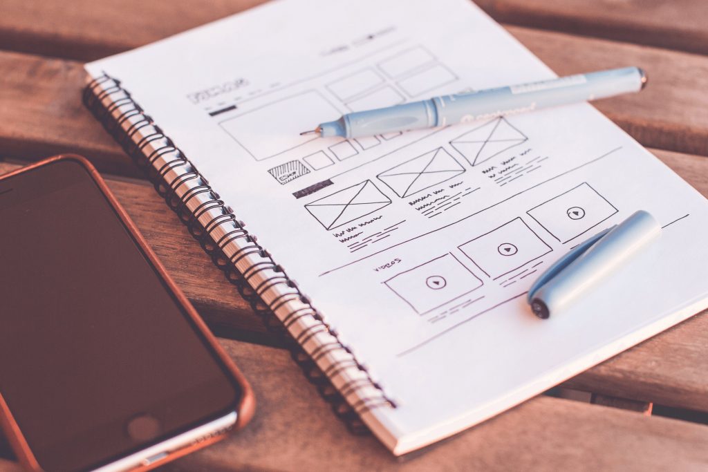
The adaptive layout or mobile version: pros and cons. Part 2
Adaptive layout and mobile version – what is the difference

In the first case, we are talking about one site, the pages which automatically adjust to the size of the visitor's screen. The second is about a complete–fledged website, the design and functionality of which are developed specifically for a certain screen resolution. The mobile version is being developed for the screen size/resolution of only a certain mobile device, but in practice, it should be beautifully displayed on most screens.
Technical requirements: checklist of the mobile version
The development of the mobile version aims to solve all the problems that arise for the mobile audience of the site:
1. create conditions for convenient page viewing;
2. make navigation and interaction with site elements comfortable;
3. Increase the page loading speed for mobile devices.
Within the framework of this article, I do not aim to describe all the technical requirements for the mobile version of the site. But you should definitely check these questions with the contractor before accepting the site:
1. What redirection is now used to create a redirect to the mobile version of the site? (the 302nd redirection should be used)
2. Is cascading tables (CSS) indexing open in the robots system file?
3. Is JS indexing activated?
4. Is the viewport enabled? This meta tag is used to indicate the area of the screen that is visible without scrolling the page. This tag is written together with the required parameters (in the Head section).
When developing a mobile version, Applet, Microsoft Silverlight, and Flash should not be used in any form.
Usability: Mobile version checklist
• Pop-ups and other types of pop–ups are undesirable - they are very annoying to the mobile audience. In addition, pop-ups often close the content and prevent the visitor from interacting with the interactive elements of the page.
• Forms should be as short as possible. A mobile visitor is much faster than a traditional desktop visitor. That is why it is undesirable to use long forms that need to be filled in to place an order. If your order form for a new customer contains a lot of fields, it is better to reduce them to a minimum or split the form filling into several screens.
• With scrolling and page magnification should not cause difficulties. Mobile visitors, due to the small size of the screen, often want to enlarge the text on the page or any element. You need to make this action as convenient as possible.
• The phone number must be the active element of the page. In other words, when you click on it, the user should immediately open the interface for calls (with the number already dialed). A mobile visitor does not like to wait and certainly will not independently rewrite the phone number numbers from the site page. Most likely, he will simply close the page and go to another site, where when tapping on the contact, the phone will open.
• Use autofill – it is convenient for those who place an order repeatedly. You don't have to fill out the form data again.
• The menu must be accessible from any page of the site.
• The home/home button should be accessible from any page of the site. You can make it in the form of a website logo, in the header.
• The font should not be tiny. The minimum character size is 12px: to read such a text, you still have to strain your eyes and make a certain visual effort. To make the text readable and comfortable for the eyes, it is better to use a size from 14 to 16px.
• The distance between interactive elements should be at least 28px (otherwise it will be difficult to click on them on small screens, and the elements may overlap).
• Button size: Call/Order/Find out/Buy buttons should be large enough. Do not make them too small, otherwise, it will be difficult to hit them.

The adaptive layout or mobile version: what to choose
Today, the site should be optimized as much as possible for the needs of the mobile audience. Exactly how to achieve such optimization, each site owner chooses for himself.
To summarize all of the above, we offer a comparison of advantages and disadvantages:
• Advantages of the mobile version – it loads quickly, is convenient, and is beautiful.
• Disadvantages of the mobile version – it does not look beautiful on all screens of mobile devices. For example, on tablets, the mobile version can be displayed very chaotically (automatically stretching and spreading all the elements from each other over a long distance). Another disadvantage of the mobile version is that, as a rule, it has only the basic functionality and there is no functional diversity in the full version.
• Advantages of adaptive – it is cheaper (as a rule), and the content remains more or less readable on screens of any size.
• Disadvantages of adaptive – if there are a lot of pages on the site and the site is heavy (unoptimized), then adaptive will slow down.
What to choose?
If the site is "heavy" (in terms of optimization, content, and functionality), then you can develop a full-fledged mobile version. If the site is small and simple, the adaptive layout features are enough.
Headings: Programming & Web


