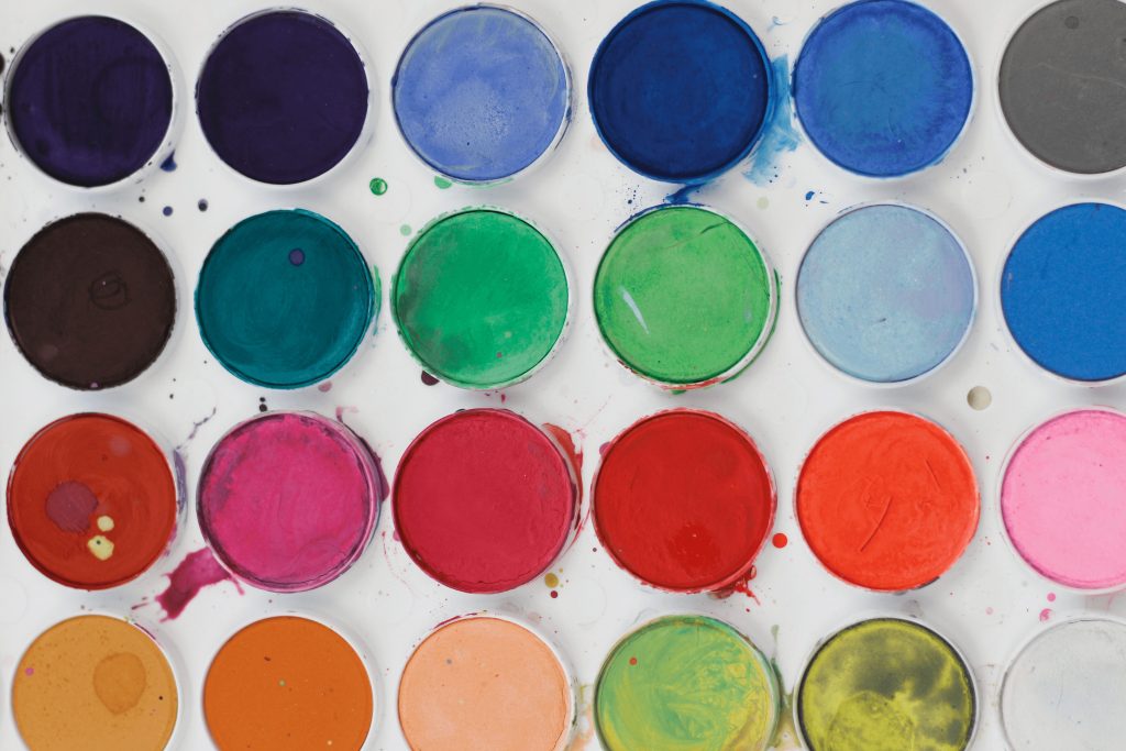
The right combinations and selection of color for the site
Color is the first thing that users notice when visiting a web resource. They help visitors understand the site and navigate through it. But most importantly, they play a huge role in customers' decisions to purchase a product. Certain shades make us feel and react differently. That is why it is critically important to choose the right colors for the site in order to guarantee its success with the audience.
Yes, it can be argued that content plays a crucial role in attracting users. And people really like interesting and useful information. But you need to draw attention to it, and here the color palette of the web resource comes into play.

Psychology of color: features of perception
Naturally, in order to understand which colors are better to use for a website, you need to know the psychology of their influence. Different shades are associated with certain meanings and sensations that they convey to the person perceiving them. To develop a truly successful design, it is necessary to select a range, taking into account the emotional response it can cause. An effective palette helps to increase the conversion rate.
The main colorful associations look like this:
• red: strength, energy, passion. It can promote active action. It is often used to cause a feeling of hunger and desire.
• orange: warmth, joy, enthusiasm. Great for positive messages. Reminds of friendliness.
• yellow: happiness, intelligence, sunlight. Helps to bring confidence and inspiration to the design. It should not be abused, as it tires the eyes and can cause anxiety.
• green: growth, ambition, nature. It refreshes and creates the feeling that the brand is on the rise.
• blue: calm, confidence, reliability. It inspires confidence and gives a sense of peace.
• purple: creativity, luxury, mystery. It can broadcast power as well as sophistication and some mysticism.
• black: power, mystery, elegance. It can be modern, intriguing, serious, or tragic. Perfect for creating contrast.
• white: purity, innocence, and safety. Gives a feeling of light and inspiration. In excess, it causes a feeling of emptiness.
The listed values are common, but they may resonate differently with a particular audience. Therefore, it is important to take into account the perceptions of target users, taking into account their gender, age, and religious beliefs. Use testing to collect as much relevant data as possible.
7 basic color schemes for design
In order not to drown in the creative process of choosing a palette for the site, the designers have identified seven common color schemes that help speed up creative work. These include:
1. Monochromatic
It uses a single color and its derivative shades to help create a unified appearance. Sometimes this color scheme lacks contrast, but it looks very neat and polished. Suitable for creating charts and graphs.
2. Similar
It is based on a combination of one color with two others that are next to it on the color wheel. This scheme is perfect for developing a softer and less contrasting design. It can be used to create images because all the elements are perfectly combined with each other.
3. Complementary
A scheme based on the use of two shades located opposite each other on the color wheel. This is the maximum contrast combination that you should be careful with. It is better to use one tone as a background and the second as an accent. High contrast allows you to highlight important moments and messages.
4. Separate-complementary
Its main difference from the previous one is that it uses not the contrasting color itself but two adjacent shades. Thus, a softer contrast is obtained, which does not look so defiant.
5. Triadic
Three tones are used here, which are the same distance from each other on the color wheel. It turns out to be a more balanced scheme that is suitable for comparisons.
6. Square
A scheme based on four equidistant colors. It is great for attracting attention to the site and creating interest among users.
7. Rectangular
Somewhat similar to a square one, however, it suggests a more subtle approach to color selection. The two dominant shades are quite saturated, and the additional ones are more muted.
When choosing a color scheme, follow the rules:
• wager on the web resource's usability;
• extract context from nature and natural combinations;
• think over the mood that you want to convey to users;
• experiment with various palette options;
• use the 60:30:10 rule (60% is the main tone, 30% is secondary, and 10% is accent).

Color palette for the website: how to choose?
If a company has a developed corporate identity, it is important to include its color palette in the design of the portal. This will help connect visitors to places where they can see the brand. In addition, if the web resource is designed in the corporate range, users will definitely understand that they have come to the address, regardless of the page.
The psychology of colors should be used to form the attitude of visitors to the Internet resource. It is important to clearly define the brand identity, and it is better to choose one dominant feature. For example, a company that sells camping equipment will identify itself as "reliable", and a fashion brand may strive for "sophistication".
And although each shade causes certain reactions, there are still options that are considered the best choice for web design. So, blue is considered the most win-win choice. This is due in part to the fact that it is popular among the vast majority of people. And to be quite precise, 57% of men and 35% of women. It is not for nothing that such well-known companies as Facebook, Skype, Twitter, etc. use it.
Ideally, the color palette of the portal should reflect the values, beliefs, and goals of the company. Bright shades may indicate a less formal atmosphere and more excitement, while muted ones give a business a more refined or formal look.
Don't forget about usability. If you want users to perform certain actions while on the site, you can also resort to color psychology. So, a bright button will be an excellent accent, provoking activity.
Step by step, the formation of a color scheme may look like this:
• Choose the main tone. The best way to decide on the main color is to think about the atmosphere of a product or service and find the shade that best matches it. If there is already a logo, then it makes sense to use its color palette.
• Choose additional shades. Here you can use color complements. Each shade has an analogue that makes it popular. The most popular compliments are red, green, blue, and orange.
• Select the background. It is important because it takes up the most space. And there are two options here. You can choose a muted version of the main color or stop at the traditional white.
• Choose the font tone. It seems that there is nothing to choose from because the text is usually black. But if you look closely, you will notice that this is not always the case. Black contrasts very much with other colors, which can cause eye strain. Therefore, texts are often painted in gray tones, which give the site a softer and more attractive appearance.
Conclusion
At first, it may seem that finding the right combination is easy enough. After all, we see the effective use of color all around us, from brand design to art and entertainment items, as well as fashion clothing. But the truth is that all these real projects have been carefully planned and tested. And, yes, they were most likely inspired by other objects that appeared earlier.
Choosing the perfect color design for a website is not an easy task. But if you adhere to the above rules, perhaps your online resource will become another excellent example of high-quality web design in action.
Headings: Design


